With the announcement of PANTONE 16-1546 Living Coral as the 2019 Colour of the Year, the Pantone Institute dares us to dive to new depths and embrace our vivacious side. Who’s to say that tomorrow can’t be better than yesterday? We live in a time where our walls and Instagram feeds are flooded with the likes of “All we have is now”, but this colour also asks us to acknowledge our oceans’ cries and turn awareness into action. In the eyes of our curators, this calls for artful contrasts.
A brighter world
Energetic, expressive and enlivened, Living Coral reawakens the inner child. Tinted with the slightest hint of gold, it conveys a soft sense of nostalgia, thereby inviting us to let loose a little and re-engage in the art of play—think, waves splashing against our bare feet as we dance along the shore, the sweet taste of ice cream on a hot summer’s day. The Institute elaborates, “In its glorious, yet unfortunately more elusive, display beneath the sea, this vivifying and effervescent colour mesmerises the eye and mind.”
But Living Coral isn’t just about summers spent building sand castles and snorkelling the world’s reefs—it reflects our modern-day longing to explore places deemed as exotic. To cite The School of Life’s ‘How to Travel’ essays, the term ‘exotic’ isn’t confined only to tropical destinations, “It merely means anywhere we yearn to go which we suspect has something to teach us”.
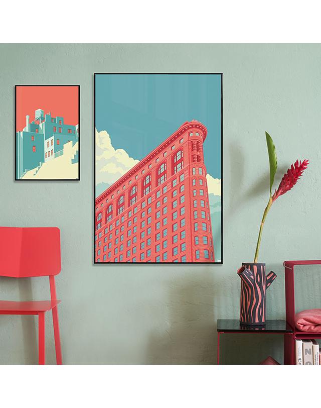
Be it in art or in life, our search for exoticism stems from a craving for further space for expression and excitement. We yearn to experience more joy in our days, to feel enlivened by our surroundings. Manifesting these qualities, which Pantone’s 2019 Colour of the Year personifies, our curators selected a series of popping cityscapes and jazzy architectural details for our Living Coral collection.

A better future
With the World Wide Web abuzz with Living Coral, we are reminded of Mother Nature’s myriad beauties—but the fragility of our ecosystem is at stake. In choosing this hue, the Pantone Color Institute echoes a gentle reminder into the world, “PANTONE Living Coral is evocative of how coral reefs provide shelter to a diverse kaleidoscope of colour”.
As a heated discourse circulates through the online sphere—bleached coral and overfishing being just a drop in the ocean of challenges our Earth faces in this day and age—everyone agrees that nature needs to be nurtured. Drawing inspiration from this general consensus, nature-themed designs run like a red thread through our Living Coral curation.
The creation of contrasts
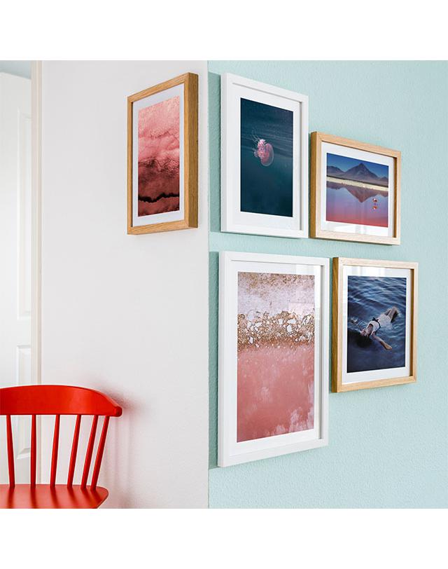
Though, as a standalone hue, PANTONE 16-1546 is aesthetically impactful, we can’t help but notice how exquisite it looks when placed in its natural surroundings. Mirroring the duality of the messaging inherent in this dramatic shade, our search for innate contrasts takes us straight to the seas. Pair Living Coral prints with endless horizons and coastal landscapes to see calm, aquatic snapshots come alive alongside expressive orange-tinged brushstrokes, crystal clear waters shimmer forth beside brilliant and flaming floral patterns.
Text: Maia Frazier