Every December, the Pantone Institute announces the ‘Color of the Year’, paving the way for future fashion and design trends. For 2020, the colour experts chose a timeless colour that boasts both beauty and depth: Classic Blue 19-4052. In contrast to the bright and lively Living Coral of 2019, this soothing shade invites us to take a moment of quiet contemplation and reflect on the past, present and future.
Learn more about the Pantone Colour of the Year as we explore the multifaceted nature of Classic Blue.
Reassuringly timeless
Classic and elegant, Pantone's Colour of the Year 2020 evokes the depth and stillness of the night. Classic Blue is a subtle colour that expresses both the simplicity of life's little pleasures and the reassuring comfort of everyday rituals. Symbolizing nightfall and the renewal of each morning, it offers both the assurance of stability, and the promise of a new beginning.
It’s no coincidence that the Pantone Institute has chosen a classic shade to accompany us into the new year. The reassuring qualities of 19-4052 Classic Blue underline our desire for a reliable and stable foundation on which to build a new era. If 2019 has been rich in twists and turns, Classic Blue gives us hope that the coming year will be a more peaceful one, and highlights the possibility to overcome our uncertainties and regain confidence in our collective future.
An ode to contemplation
In a world that is always in flux, the stability that Classic Blue represents is a blessing. Used as the dominant colour in a bedroom or living room, Pantone’s colour of the year helps us to relax, regenerate and reflect. In fact, as Colour Specialist Léatrice Eiseman says, "Classic Blue encourages us to look beyond the obvious to expand our thinking; challenging us to think more deeply, increase our perspective and open the flow of communication". By letting our minds wander, this deep hue gives us the opportunity to calmly analyse and express our feelings.
This serenity serves as the guiding principle for the Classic Blue Collection, carefully curated by JUNIQE art experts. Poetic sky photography and contemplative seascapes combine with minimalist abstract designs to create a collection that is both meditative and sophisticated.
Softly softly
Discover new facets of Classic Blue by combining it with soft, pastel tones throughout your home. Take advantage of the soothing properties of Classic Blue to create a soft, romantic atmosphere by combining the shade with a delicate powder pink. The interplay between deep and light tones, reminiscent of a reddish evening sky, acts as a balm for the senses and invites you to enjoy the magical, fleeting moment that occurs between day and night.
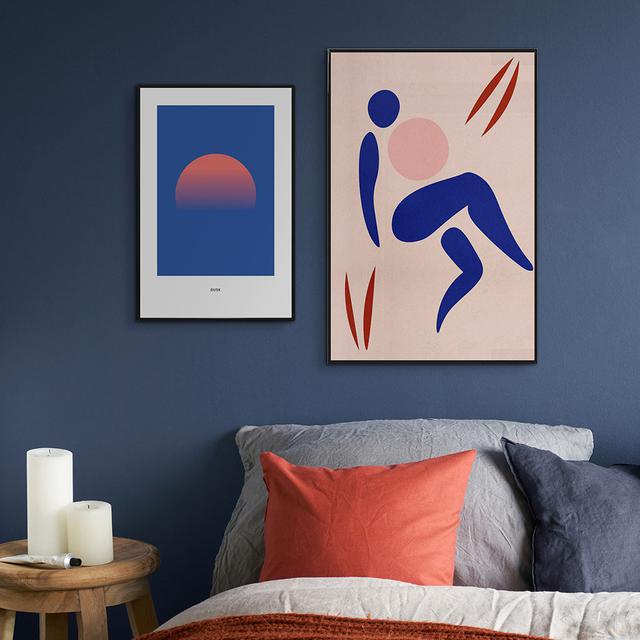
The abstract designs "Blue" by Pure, and "Dusk #6" by daylight design studio help to creative meditative mood, transforming the worries of your day into a gentle serenity that accompanies you into sleep.
A Bauhaus-inspired alliance
For a more energizing atmosphere, combine Pantone blue with primary colours such as yellow and red. This resolutely Bauhaus composition will give a little avant-garde touch to your interior while cheerfully counterbalancing the sometimes austere side of the blue. Choose abstract, minimalist works such as "Sure Thing" and "Absolute Bearing" by Tanja Schaub for a chic and timeless composition. Here, the striking contrast of blue, red, white and black adds character to this space, while remaining simple enough to stand the test of time.
Are you ready to embrace the steady, soothing power of Classic Blue? Then immerse yourself in the collection and pay tribute to the Pantone Colour of the Year 2020.
Text: Caroline Lacaille
Translation: Caitlin Hughes
Header Image: Under the Water
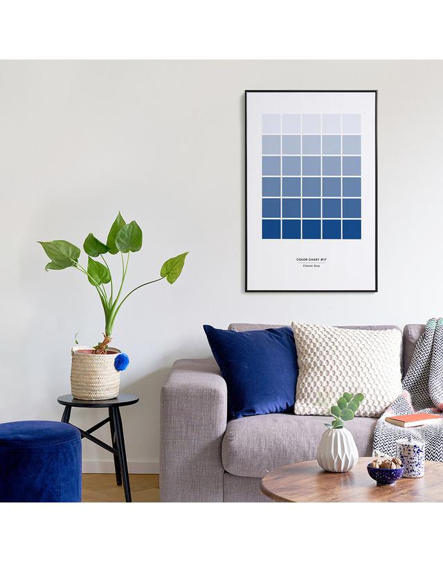
Image 1 : Classic Blue #17
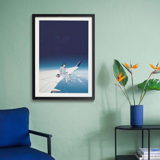
Image 2 : Mentally Somewhere Else
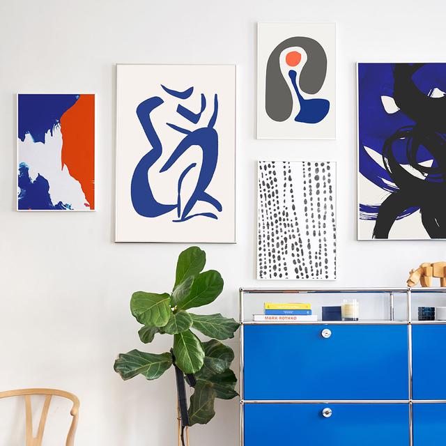
Image 4 : Colorcrash, Sure Thing, Absolute Bearings, Organical Texture and Shore